When it comes to creating a beautiful and harmonious garden, there’s more to consider than just choosing the right plants. Color theory plays a crucial role in garden design, as it can greatly impact the overall ambiance and visual appeal of your outdoor space. By understanding how colors interact with each other – from complementary and analogous schemes to triadic and monochromatic arrangements – you’ll be able to create a cohesive look that’s both aesthetically pleasing and easy on the eyes. In this article, we’ll explore the basics of color theory in garden design, including the color wheel, harmony principles, and practical tips for incorporating these principles into your own garden. Whether you’re a seasoned gardener or just starting out, our guide will help you unlock the full potential of color to transform your outdoor space into a stunning haven.
Understanding the Fundamentals of Color Theory
When it comes to creating a harmonious garden space, understanding the basics of color theory is essential. Let’s dive into the fundamental principles that will guide your palette choices and add depth to your design.
What is Color Theory and Why Does it Matter?
Color theory is the study of how colors interact with each other and with their surroundings. In garden design, understanding color theory can elevate the aesthetic appeal and functionality of outdoor spaces. It’s not just about selecting a few plants that look good together; it’s about creating a harmonious balance of hues that complement each other.
When applied to garden design, color theory plays a crucial role in setting the tone for your outdoor space. Consider the 60-30-10 rule: divide your garden into 60% dominant colors (walls, foliage), 30% secondary colors (accents, furniture), and 10% bold colors (flowers, decorations). This balance creates visual interest without overwhelming the senses.
Color theory also takes into account the emotional impact of color on our moods and well-being. Cool colors like blues and greens can evoke calmness, while warm colors like oranges and yellows stimulate energy. By thoughtfully selecting a palette that aligns with your garden’s purpose (relaxation, entertainment, or both), you’ll create an environment that not only looks beautiful but also supports its intended use.
The Color Wheel: A Guide for Gardeners
The color wheel is a fundamental tool for gardeners to understand and apply color theory principles. It’s a circular diagram that displays colors as they relate to each other. The primary components of the color wheel are primary colors, secondary colors, warm colors, and cool colors.
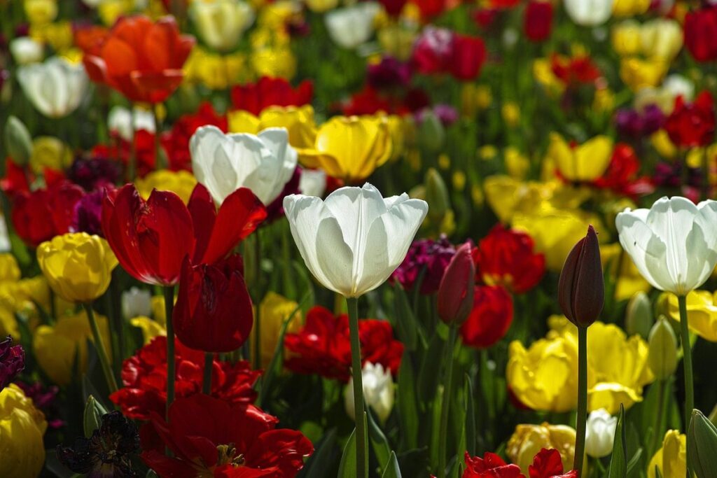
Primary colors – red, yellow, and blue – are the base colors used to create all others. Secondary colors, derived from mixing two primary colors, are green (blue + yellow), orange (red + yellow), and purple (blue + red). Warm colors, such as red, orange, and yellow, evoke feelings of warmth and energy. Cool colors, like blue, green, and purple, have a calming effect.
To create harmonious color schemes in garden design, consider the 60-30-10 rule: allocate 60% of the space to a dominant color, 30% to a secondary color, and 10% to an accent color. For example, if you’re designing a shade garden with blue accents, use blue as your dominant color, followed by green or purple as a secondary color. This balanced approach will create a visually appealing and cohesive look.
Principles of Harmony in Garden Design
As we explore color theory, let’s dive into the fundamental principles that guide harmonious garden design, creating a cohesive and visually appealing space. This includes balance, contrast, and proportion among other key considerations.
Monochromatic Color Schemes: Creating a Cohesive Look
When it comes to creating a cohesive look in your garden design, monochromatic color schemes can be a powerful tool. By selecting colors that fall within a single hue, you can create a visually appealing and harmonious space that exudes a sense of tranquility and balance.
One way to achieve a monochromatic look is by choosing analogous colors – those that are next to each other on the color wheel. For example, if you love the vibrant tone of bluebells (blue-purple), you can pair them with lavender or lilac flowers for a cohesive and calming atmosphere. This approach allows you to create depth and interest within a single color family without overwhelming the senses.
Another option is to opt for complementary colors, which are directly opposite each other on the color wheel. For instance, if you choose blue as your primary color, you can use yellow-green or orange-yellow accents to add contrast and visual excitement to your garden design. This approach may seem counterintuitive, but trust us – it can add a pop of energy and vibrancy to an otherwise monochromatic space.
Ultimately, the key to successful monochromatic color schemes is selecting colors that work harmoniously together within a single hue. Experiment with different shades and tints to create depth and interest, or stick with a more subtle approach by using variations of the same color throughout your garden design.
Analogous Color Schemes: Soft Transitions in Nature
When it comes to creating a harmonious garden design, analogous color schemes are an excellent choice for achieving soft transitions between spaces. These colors are next to each other on the color wheel, which allows them to blend seamlessly and create a sense of continuity.
To select analogous colors that work well together, consider the natural palette found in your surroundings. Look at the hues of foliage, flowers, and soil – these will serve as a great starting point for your color scheme. For example, if you have a garden with plenty of greenery, you can use shades of blue-green, yellow-green, or even soft purples to create an analogous palette.
When choosing specific colors, remember that subtle variations in tone and saturation can make a significant difference in creating visual interest. You can also experiment with different ratios of colors to find the perfect balance for your space. For instance, using 60% of one color, 30% of another, and 10% of a third will create a harmonious analogous color scheme that flows effortlessly through your garden. By understanding how analogous colors work together, you’ll be able to craft a visually stunning garden design that’s both soothing and engaging.
The Role of Hue, Saturation, and Value in Garden Design
When it comes to color theory in garden design, understanding hue, saturation, and value is crucial for creating a harmonious and visually appealing outdoor space that reflects your personal style. Let’s break down how each component plays a vital role in your garden design.
Understanding Hue and Its Effects on Mood
When designing a garden, one of the most critical aspects to consider is the impact of hue on mood and atmosphere. Different hues can evoke distinct emotions and create varying levels of energy in a space. Warm colors like reds, oranges, and yellows tend to stimulate and energize, while cool colors like blues and greens have a calming effect.
For instance, a garden featuring warm-toned foliage and flowers can create an inviting ambiance, perfect for outdoor living spaces or areas meant for entertainment. On the other hand, using soothing blue tones in plant choices can lead to relaxation and tranquility. This understanding is essential when selecting plants for specific garden sections, such as areas adjacent to pools, patios, or walkways.
To effectively incorporate hue into your design, consider the following: begin by assessing the space’s existing color palette and natural light conditions. Next, choose plants with complementary hues that enhance the intended atmosphere. Balance warm and cool tones thoughtfully, ensuring they don’t overwhelm one another. By making these conscious choices, you can create a garden environment that promotes relaxation, energy, or both – ultimately elevating its aesthetic appeal and usability.
Saturation: Balancing Brightness with Rhythm
When it comes to creating visually appealing gardens, saturation plays a significant role in our perception of color. Saturation refers to the intensity or brightness of a color, and it can greatly impact the overall aesthetic of your garden design.
Incorporating highly saturated colors into your garden can create bold statements and draw attention to specific features. However, too much saturation can overwhelm the senses and detract from the natural beauty of the surroundings. To balance bright colors with natural elements, consider using them as accents rather than overwhelming the entire space. For example, a brightly colored door or bench can add visual interest without overpowering the garden.
To achieve this balance, try pairing highly saturated colors with neutral tones to create contrast and visual harmony. This can be done through plant selection, furniture choices, or even accessories like pots and vases. By incorporating these design principles, you’ll be able to harness the impact of saturation while maintaining a natural, harmonious atmosphere in your garden.
Color Relationships and Contrasts in Garden Design
When it comes to creating visually appealing garden spaces, understanding how colors interact is crucial. This means mastering color relationships and contrasts to create a cohesive look that complements your garden’s unique style.
Complementary Colors: Creating Visual Interest through Contrast
When it comes to creating visual interest and breaking up large areas in garden design, complementary colors are an excellent choice. Complementary colors are pairs of colors that are directly opposite each other on the color wheel. This contrast creates a visually appealing effect that can add depth and energy to your garden.
One of the benefits of using complementary colors is that they create a sense of tension, which can be particularly effective in large or open spaces. By placing a bright blue flowerbed against a warm yellow stone wall, for example, you create a striking contrast that draws the eye through the space.
In practice, consider pairing cool blues and greens with warm oranges and yellows to add visual interest to your garden. You can also use complementary colors to frame a focal point, such as a statue or water feature. By thoughtfully incorporating complementary colors into your design, you can create a unique and dynamic space that’s both beautiful and engaging.
Triadic Color Schemes: A Balanced Approach to Harmony
Triadic color schemes are a unique and effective way to create balance and harmony in garden design. By combining three colors equally spaced from each other on the color wheel, triadic schemes can add depth and visual interest to outdoor spaces. To achieve this effect, choose one dominant color for the main features of your garden, such as plants or hardscaping, and then select two other colors that are equidistant from it.
For example, if you’ve chosen a vibrant blue for your main features, your triadic colors could be yellow and red. These complementary colors will create a visually appealing contrast and add warmth to the space. To implement this scheme effectively, consider using one color as an accent, while the other two provide balance. This not only creates visual interest but also guides the viewer’s eye through the garden.
When working with triadic schemes, remember that less is often more. Using too many colors can create a chaotic atmosphere, so stick to three main colors and subtle variations of them.
Practical Applications of Color Theory in Garden Design
When it comes to bringing your garden design to life, color plays a crucial role in creating visual harmony and making a lasting impression on visitors. In this section, we’ll explore practical ways to apply color theory principles to elevate your outdoor space.
Case Studies: Successful Color Schemes in Real Gardens
Let’s take a look at some real-life examples of successful color schemes in gardens. The English Garden at Sissinghurst Castle is a prime example of thoughtful color placement. This garden features vibrant hues like scarlet and blue, which create striking contrasts with the lush greenery. To replicate this effect, try pairing bold flowers with softer foliage colors.
Another excellent example is the Japanese Garden at the New York Botanical Garden. This serene oasis employs a calming palette of greens, blues, and yellows to evoke a sense of tranquility. For a similar look, balance bright colors like orange or yellow with soothing shades of green and blue-green.
Consider the Monet garden at Giverny in France – an iconic example of harmonious color use. Soft pink peonies mingle with vibrant purple irises and delicate lavender blooms, creating a visually appealing display. To achieve this blend, experiment with pairing gentle pastels with rich jewel tones. Remember to balance bold colors with softer accents to avoid visual overload.
The key is to select colors that work together in harmony while still evoking the desired mood or atmosphere. Analyze real gardens and take note of how different colors interact. Experiment with varying shades, combinations, and proportions to create a unique color scheme for your own outdoor space.
Tips for Applying Color Theory in Your Own Garden Design
When applying color theory to your garden design, it’s essential to consider the colors already present in your outdoor space. Start by observing the hues of local flora, such as the foliage and blooms of native plants. These natural colors will serve as a foundation for your palette, ensuring a harmonious balance between the man-made elements and the existing landscape.
To select colors that work well with local flora, consider the 60-30-10 rule: allocate 60% of your garden’s color scheme to dominant hues, 30% to secondary shades, and 10% to accent colors. This will create a balanced and visually appealing composition. For example, if you have a prominent patch of bluebells in your lawn, use their vibrant blue as the dominant hue for your design.
When choosing accent colors, think about complementary hues that will enhance the beauty of local flora. For instance, pair deep blues with rich yellows or soft pinks to create a stunning contrast.
Frequently Asked Questions
How do I apply color theory principles to my existing garden design?
When revamping an existing garden, it can be challenging to integrate new color schemes without disrupting the overall harmony. Start by identifying a few key areas where you’d like to introduce new colors and balance them with existing ones. Consider the surrounding landscape, hardscapes, and focal points in your garden when making decisions about which hues to incorporate.
What’s the difference between analogous and complementary color schemes?
While both techniques are used to create harmony in garden design, analogous color schemes involve using adjacent colors on the color wheel (e.g., blue-green, green-yellow), whereas complementary color schemes pair colors directly opposite each other (e.g., red-blue). Each has its own unique benefits and can be used to achieve different moods and effects.
Can I use a single dominant hue throughout my garden?
Yes, monochromatic color schemes can create a stunning, cohesive look in your garden. However, it’s essential to consider the varying shades and tints of your chosen hue to avoid creating visual monotony. Consider incorporating subtle contrasts through foliage texture, plant shape, or hardscaping elements to add depth and interest.
How do I balance warm and cool colors in my garden design?
To achieve a harmonious blend of warm (red-yellow) and cool (blue-green) colors, introduce them in balanced proportions. For example, if you have a predominantly warm-colored patio area, use cool-toned plants or accessories to create visual interest. Conversely, if your garden features plenty of cool tones, inject warmth with red-foliaged plants or terra cotta accents.
Can I use color theory principles when designing for small spaces?
Absolutely! Even in compact gardens, color theory can be applied effectively to create a visually appealing and harmonious atmosphere. Focus on incorporating bold colors through statement pieces like planters, furniture, or decorative accents, rather than overwhelming the space with too many different hues.