When it comes to creating a stunning garden, choosing the right flower color combinations can be a daunting task. With so many colors and styles to choose from, it’s easy to get overwhelmed. But don’t worry, with a little guidance, you’ll be on your way to crafting a beautiful and cohesive look that reflects your personal style.
In this article, we’ll explore expert tips for creating stunning flower color combinations in your garden. From monochromatic schemes to bold contrasts, we’ll delve into the world of color theory and provide inspiration for choosing the perfect hues to create a harmonious and visually appealing space. Whether you’re a seasoned gardener or just starting out, this guide will walk you through the process of selecting flower colors that complement each other beautifully and enhance your garden’s overall aesthetic.
Choosing the Right Color Scheme
When selecting a color scheme for your flower arrangements, it can be overwhelming with so many options available. Let’s break down some popular combinations to help you make a beautiful choice.
Monochromatic Magic: The Power of Single-Hued Flowers
A monochromatic color scheme is all about working with different shades of the same hue to create a cohesive and visually appealing look. And what better way to achieve this than with single-hued flowers? By sticking to a single color, you can create a harmonious and elegant atmosphere in your arrangement.
When choosing a monochromatic flower palette, consider selecting flowers that gradate from light to dark shades of the same color. For example, pairing pale pink roses with deeper blush-colored ones will create a beautiful ombre effect. You can also experiment with different shades of the same color by incorporating baby’s breath or queen anne’s lace in various hues.
To take your monochromatic arrangement to the next level, think about adding greenery in varying shades of the same color as well. For instance, pairing soft sage leaves with deep emerald eucalyptus will add depth and visual interest to your bouquet. By embracing the beauty of single-hued flowers, you’ll create a stunning and cohesive look that’s sure to impress.
Analogous Harmony: Pairing Colors That Blend Together
When selecting colors for a harmonious arrangement, it’s essential to understand the principle of analogous harmony. This technique involves pairing colors that are adjacent to each other on the color wheel, creating a soothing and cohesive look.
To achieve analogous harmony, focus on three main colors: a primary color, its nearest neighbor on the color wheel, and the color opposite the primary color (known as the complementary color). For example, if your primary color is a soft blue, choose a gentle purple-blue hue for your secondary color and a vibrant orange-yellow shade as the accent.
Consider the beautiful combination of pastel pink, baby blue, and pale peach in a lush bouquet. These colors not only complement each other but also evoke a calming atmosphere. To recreate this look, select three adjacent shades on the color wheel that resonate with you, balancing warm and cool tones to create visual equilibrium.
Complementary Contrast: Mixing Colors for Maximum Impact
When pairing flowers for a visually striking display, complementary contrast is key. This technique involves combining colors that are opposite each other on the color wheel to create a dynamic and eye-catching arrangement.
For example, pair bright yellow tulips with deep purple irises or hot pink roses with cool blue delphiniums. These contrasting hues will draw attention and create a sense of visual tension, making your display more interesting and memorable.
To achieve this effect, consider the 60-30-10 rule: allocate 60% of your arrangement to a dominant color, 30% to a secondary hue that complements it, and 10% to an accent color that adds contrast. This balance will create a harmonious yet visually striking display.
In practice, think about pairing warm colors like orange or red with cool colors like blue or green. For instance, combine orange marigolds with blue forget-me-nots for a stunning contrast of warmth and coolness. Experimenting with complementary colors is all about finding the right balance to create a show-stopping arrangement that’s sure to impress.
Color Wheel Fundamentals
To create stunning flower arrangements, it’s essential to understand how colors interact on the color wheel. Let’s break down the basics of color harmony and how to choose complementary hues.
Understanding Color Relationships
When working with flowers and color combinations, understanding the relationships between colors is crucial to creating visually appealing arrangements. The color wheel serves as a fundamental tool for achieving harmony and balance in floral design.
The color wheel is divided into three main categories: primary, secondary, and tertiary colors. Primary colors – red, blue, and yellow – are the basic building blocks of the color spectrum. They cannot be created by mixing other colors together. Secondary colors, on the other hand, are produced by combining two primary colors. For example, green is created by mixing blue and yellow.
Tertiary colors are formed by mixing a primary color with a secondary color. These include colors such as blue-green or yellow-orange. When selecting flower colors for an arrangement, it’s essential to consider the relationships between these different categories of colors. By understanding how colors interact on the color wheel, you can create a cohesive and visually appealing palette that complements your flowers.
For instance, pairing red roses with orange gerbera daisies creates a harmonious combination because both colors share a similar hue. This type of color relationship is known as analogous harmony.
The 60-30-10 Rule: A Simple Guide to Balance
The 60-30-10 rule is a timeless principle that can be applied to flower arrangements to achieve perfect balance. This simple yet effective technique will help you create visually appealing and harmonious color combinations. To use the 60-30-10 rule, start by assigning 60% of your arrangement to a dominant color or flowers with similar hues. This color should be the main focal point of the arrangement.
Next, allocate 30% to secondary colors that complement the dominant hue. These colors can add depth and interest to the arrangement without overpowering the dominant color. For example, if you’re using red roses as your dominant color (60%), you could pair them with yellow tulips (30%) for a harmonious contrast.
Finally, use 10% of your arrangement for an accent color that adds a pop of vibrancy and personality to the overall design. This is where you can get creative and add unique flowers or greenery in bold colors like orange, purple, or blue. Remember, balance is key, so don’t be afraid to experiment and adjust the proportions as needed until your arrangement looks visually appealing to your eye.
Tips for Using Neutrals Effectively
When it comes to creating stunning flower arrangements, incorporating neutral-colored flowers is an excellent way to add depth and balance to your design. Neutrals can be a bit tricky to work with, but with the right approach, they can elevate your arrangement from good to great.
Start by choosing a few statement-making flowers in bold colors and pairing them with a mix of neutral blooms. For example, combine vibrant red tulips with creamy white roses, soft pink peonies, and pale yellow gerbera daisies. This combination creates visual interest while allowing the neutrals to provide a soothing background.
To use neutrals effectively, consider their role in the arrangement: act as a filler, add texture, or create contrast. For instance, pale gray lisianthus can be used as a filler between brighter blooms, while white calla lilies can add height and drama. Don’t be afraid to experiment with different textures – pairing smooth roses with ruffled peonies creates a beautiful visual effect.
Remember, neutrals are all about restraint; use them sparingly to avoid overwhelming the arrangement. By balancing bold colors with neutral flowers, you’ll create a harmonious and visually appealing design that’s sure to impress!
Popular Flower Color Combinations
When it comes to creating a stunning floral arrangement, pairing flowers of complementary colors can elevate your design from good to great. Let’s explore some popular flower color combinations that will inspire your next bouquet.
Bright and Bold: Sunflower, Dahlias, and Zinnias
When it comes to adding a pop of color and energy to your garden display, few combinations can beat the classic pairing of sunflowers, dahlias, and zinnias. These bright blooms are like a ray of sunshine on a cloudy day, instantly lifting the mood and adding vibrancy to any arrangement.
Sunflowers, with their towering height and cheery yellow petals, set the tone for this bold combination. Their statuesque stems provide the perfect backdrop for the lush, pom-pom-like blooms of dahlias in vibrant shades of pink, orange, and purple. Meanwhile, the delicate, daisy-like flowers of zinnias add a playful touch with their soft colors and ruffled petals.
To incorporate these show-stopping blooms into your garden display, consider planting them together in a sun-drenched area. Dahlias tend to bloom mid-summer through fall, while sunflowers stand tall from late spring to early summer. Zinnias, meanwhile, burst into bloom just as the dahlias are winding down, providing a colorful bridge between seasons. By pairing these three statement flowers, you’ll create a vibrant and dynamic display that’s sure to draw admiring glances all season long!
Soft and Soothing: Pastel Hues in Bloom
Pastel hues are perfect for creating a soft and soothing atmosphere in any setting. When it comes to flower arrangements, these delicate colors can add a touch of elegance and whimsy to your design. To create a beautiful pastel-colored arrangement, consider pairing pale pink peonies with lavender roses and wispy baby’s breath. This combination is not only visually stunning but also evokes a sense of serenity.
For a more monochromatic look, opt for different shades of blue in your flowers. Delicate sky-blue forget-me-nots paired with powder-puff purple irises create a soft and soothing palette that’s perfect for springtime arrangements. If you want to add some greenery to the mix, consider using eucalyptus or ferns in a light gray or pale yellow hue.
Remember, the key to creating a beautiful pastel-colored arrangement is balance and restraint. Avoid over-accessorizing with too many different textures and colors – instead, focus on allowing your flowers to take center stage. With a little creativity and experimentation, you can create stunning flower arrangements that will transport your guests to a world of soft, soothing beauty.
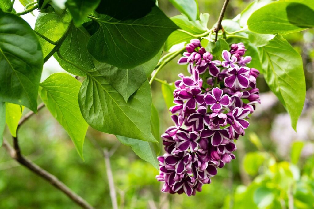
Dramatic Contrast: Dark Colors Against a Light Background
When it comes to creating stunning flower arrangements, one of the most dramatic and eye-catching techniques is using dark-colored flowers against a light background. This striking contrast can add depth and visual interest to your blooms, making them stand out in a room.
To achieve this look, try pairing dark-colored flowers like burgundy, navy blue, or black with light-colored backgrounds such as cream, ivory, or pale gray. For example, consider combining deep red roses with a soft white background for a romantic and elegant feel. Alternatively, pair navy blue delphiniums with a creamy yellow and green bouquet for a bold and playful look.
Remember to balance the dark colors with lighter elements to avoid overwhelming the senses. You can achieve this by adding some greenery like eucalyptus or ferns to break up the dark blooms. This will create a visually appealing contrast that draws the eye to the flowers while maintaining harmony in the arrangement. By incorporating dark-colored flowers into your arrangements, you’ll add a touch of sophistication and drama to your blooms.
Considerations for Specific Garden Settings
When planning a flower color combination, it’s essential to consider how your garden’s surroundings will impact the final look. Think about whether you’re working with a sunny backyard, shaded patio, or small balcony space.
Creating a Focal Point with Colorful Flowers
When creating a focal point with colorful flowers, consider using a bold and bright color combination to draw the eye towards a specific area of your garden. For instance, if you have a large stone statue or a beautiful water feature, surround it with vibrant flowers like sunflowers, gerbera daisies, or zinnias in shades of yellow, orange, or red. These warm colors will create a sense of energy and excitement, making the focal point stand out.
Alternatively, you can use cool-toned flowers like delphiniums, hydrangeas, or bluebells to create a calming and serene ambiance around your garden’s focal point. For example, pair a majestic birdbath with a backdrop of soft blues and purples to evoke a sense of tranquility. Remember to balance the colors by mixing warm and cool tones to avoid overwhelming the space.
When selecting flowers for your focal point, consider the 60-30-10 rule: 60% of the arrangement should be a dominant color, 30% a secondary color, and 10% an accent color. This ratio will create visual interest and harmony in your garden, making it more appealing to the eye. Experiment with different combinations to find the perfect balance for your specific garden setting.
How to Use Color to Create a Sense of Depth
When designing a garden, it’s easy to focus on the colors and textures of individual plants. However, creating a sense of depth is crucial for drawing the viewer’s eye through the space and making the most of its three-dimensional potential.
To achieve this, consider using color to create visual layers. Begin by planting tall, dark foliage in the background, such as black calla lilies or dark-leaved coleus. These will provide a dramatic backdrop for mid-level plants with lighter colors like coral hibiscus or bright yellow marigolds.
Next, introduce mid-toned elements that catch the eye but don’t overwhelm the space. Lavender, in particular, is excellent at bridging this gap between warm and cool colors. Finally, add pops of bright color to draw attention forward – consider daisies, gerbera daisies, or red petunias for a cheerful effect.
Remember, balance is key: too many competing colors will overwhelm the space, while too few may create an uninteresting expanse. By thoughtfully layering your garden’s colors and textures, you can create a visually engaging, layered landscape that rewards exploration from multiple vantage points.
Seasonal Flower Arrangements: Choosing Colors That Match Your Environment
When it comes to creating seasonal flower arrangements, choosing colors that match your environment is crucial. This not only enhances the aesthetic appeal of your arrangement but also reflects the mood and atmosphere of the season.
For winter, opt for rich jewel tones such as emerald green, navy blue, and crimson red to evoke a sense of luxury and coziness. These deep hues are perfect for creating a warm and inviting atmosphere in a cold-weather setting. Consider pairing these colors with frosted glass vases or mercury glass containers to add an extra touch of winter wonderland magic.
In contrast, spring is the perfect time to incorporate lighter, brighter hues like pastel pink, baby blue, and sunny yellow. These colors are sure to bring a sense of hope and renewal to your arrangement, reflecting the season’s fresh start. Consider pairing these colors with natural elements like twigs, branches, or seed pods to add texture and interest.
Summer is all about bold and vibrant colors like coral, turquoise, and hot pink. These colors are perfect for creating a playful and carefree atmosphere that captures the essence of the long, sunny days. Consider pairing these colors with glass containers in fun shapes or bright ceramics to add an extra pop of color.
Fall is a great time to incorporate warm, earthy tones like burnt orange, mustard yellow, and deep red. These colors are perfect for creating a cozy and inviting atmosphere that reflects the season’s harvest theme. Consider pairing these colors with natural elements like pinecones, acorns, or dried leaves to add texture and depth.
Ultimately, when choosing colors for your seasonal flower arrangements, remember to have fun and get creative! Experiment with different combinations of colors and textures to create a look that truly reflects your personal style and complements your environment.
Putting it All Together: Tips for Creating Customized Color Schemes
Now that you’ve learned how to combine flowers by color and by bloom time, let’s bring everything together and create a customized color scheme tailored just to your style. We’ll share expert tips to make it happen.
Evaluating Personal Style and Preferences
When choosing colors for your garden displays, it’s essential to consider your personal style and preferences. This is where evaluating your individual tastes comes into play. Think about the aesthetic you want to achieve in your outdoor space – do you prefer a whimsical, playful vibe or a more serene, elegant look?
Consider your favorite flowers, foliage, and colors used indoors. Are there any patterns or color combinations that repeatedly show up in your decor? These are likely clues to your personal style. For instance, if you’re drawn to soft pastels, it’s likely a reflection of your calming personality.
To evaluate your personal style and preferences, take some time to reflect on the following:
• What colors do I naturally gravitate towards when shopping for flowers or decorating my indoor space?
• Are there any specific themes or styles that consistently appeal to me (e.g. bohemian, minimalist, coastal)?
• Do I have a preferred color palette in mind for my garden displays? If so, what are the key hues and why do they resonate with me?
By understanding your personal style and preferences, you can create garden displays that not only showcase stunning flower combinations but also reflect your unique personality.
Experimenting with Different Combinations
When experimenting with different color combinations, it’s essential to test them out before committing to a long-term look. One way to do this is by creating a “color board” – a physical or digital collection of swatches representing your desired palette.
Start by gathering images and fabric scraps in various shades that appeal to you. Arrange these elements on a board or create a virtual version using a design app. Move colors around, exploring how they interact with each other. This exercise helps identify potential harmony issues before investing time and resources into an entire arrangement.
Another approach is to use paper cutouts or paint swatches to create mock-ups of your desired look. Place these mock-ups near the flowers you’re working with, observing how they affect the overall visual impact. You can also experiment with smaller arrangements using a few stems at a time, testing the combination’s effectiveness in different contexts.
Remember, experimenting is all about having fun and learning from your mistakes. Don’t be afraid to try new combinations and adjust as needed – it’s an iterative process that will ultimately lead you to a cohesive, beautiful color scheme.
Maintenance and Care: How to Keep Your Flowers Looking Their Best
Now that you’ve created your stunning custom color scheme, it’s time to focus on maintaining those gorgeous flowers. Proper care is crucial to keep them looking their best and extend their vase life.
Start with watering: check the soil daily, and water only when the top inch feels dry. Be cautious not to overwater, as this can lead to root rot and a shorter lifespan for your blooms. For example, orchids prefer well-draining pots and should be watered once a week during the summer months.
Pruning is another essential step in flower maintenance. Remove any dead or wilted petals to prevent bacterial growth and encourage new growth. This technique also helps maintain the shape of your flowers and promotes healthy blooming. For roses, for instance, pruning should be done in late winter or early spring, just before new growth begins.
Pest control is also vital: inspect your blooms regularly for signs of aphids, spider mites, or other pests that can damage your flowers quickly. Use organic pest control methods whenever possible, such as neem oil or insecticidal soap.
Frequently Asked Questions
Can I apply monochromatic color schemes to small spaces, like a balcony or patio?
Yes, you can definitely adapt monochromatic flower arrangements to smaller areas. In fact, using different shades of the same hue can create a sense of visual cohesion and make even tiny spaces feel more expansive. Just be mindful of the scale and choose flowers that are proportional to your space.
How do I balance bold and bright colors with neutral elements in my garden?
Balancing bold and bright colors with neutrals is all about finding harmony through contrast. Introduce neutral elements, like greenery or white flowers, to provide a calming background for your bold blooms. This will create visual interest without overwhelming the senses.
Can I mix different flower color combinations to create a unique look?
Absolutely! Mixing and matching various flower color schemes can result in a one-of-a-kind aesthetic that reflects your personal style. Just remember to balance contrasting colors with neutral elements or a unifying theme to prevent visual overload.
How do I choose the right flowers for my specific garden climate?
When selecting flowers, consider your local climate and the specific growing conditions of your garden. Choose blooms that thrive in your region’s temperature and light levels to ensure they remain healthy and vibrant throughout the season.
Can I use digital tools or apps to plan and visualize flower color combinations before planting?
Yes, there are many digital tools and apps available that can help you design and visualize different flower color schemes before implementing them in your garden. This can be especially helpful for those who struggle with color theory or want to experiment with new ideas without committing to a specific arrangement.